Bart Redesign Turned Clipper App Creation
Designing a virtual alternative for the Bay Area’s universal public transportation smart card
Overview
Why Clipper?
I grew up traveling to San Francisco on BART. After moving to the city, it’s been my primary mode of transport. Despite being in a city known for tech and innovation, BART as a service hasn’t kept up with the times. For this project, I improved the current app in a way that reflects Silicon Valley’s innovative soul.
Current State of Affairs
Analyzing the current Bart App and Clipper system

Bart App
An audit of the current app revealed room for improvement around user-friendliness as well a lack of features that would have helped increase the business’ revenue.
Confusing interface (unclear CTAs and visual design)
No ticket purchase option
No electronic ticket

Clipper Card
An audit of the current system showed that many stations had ticket machines that were not user friendly, often broken, and often caused long lines to form in the station.
Confusing interface (unclear CTAs and visual design)
Bart automatically attempts to charge 20 dollars
Outdated machines
Poor signage
The User Flow
Aiming for an easy-to-use, efficient user experience, I created a streamlined flow that allowed the user to quickly add balance to their e-ticket while on the go. The app is designed to replicate a similar experience as the physical card. Users would maintain a balance on their e-ticket and their fare would be deducted after exiting the station.
User personas
Commuter
Frequent rider
Daily usage of Clipper Card
Very familiar with BART system
Tourist
Unlikely to ride more than a few times
No Clipper Card
Unfamiliar with BART system
Discovery Phase
Problem
The current bart ticketing system is confusing and complicated. The ticketing machines rely on recall rather than recognition, leaving tourists confused in need for assistance. The bart app is currently missing opportunities to keep the user informed, engaged, and traveling seamless.
Hypothesis
An electronic ticket would save users the hassle of having to keep track of their physical card or load their card at kiosks. Packaged in an app that would also provide riders with valuable real-time BART updates would create a better user experiences for commuters and tourists alike.
Solution
By providing users with a convenient, easy-to-use electronic version of the Clipper Card, they’ll stay up-to-date on travel advisories, be able to skip fare lines, and never misplace Clipper Card again.
KPI
Increase in new users
Different Iterations
Honing my visual and interaction design skills, I pushed myself to work through many iterations of each screen. Below, you can see 6 different versions of the e-ticket screen.
During this process, I learned a lot about designing within technical constraints and staying mindful of engineering feasibility and scope.

Final Screens
Here are my high-fidelity screens of the Clipper Card app, designed for utility and efficiency.

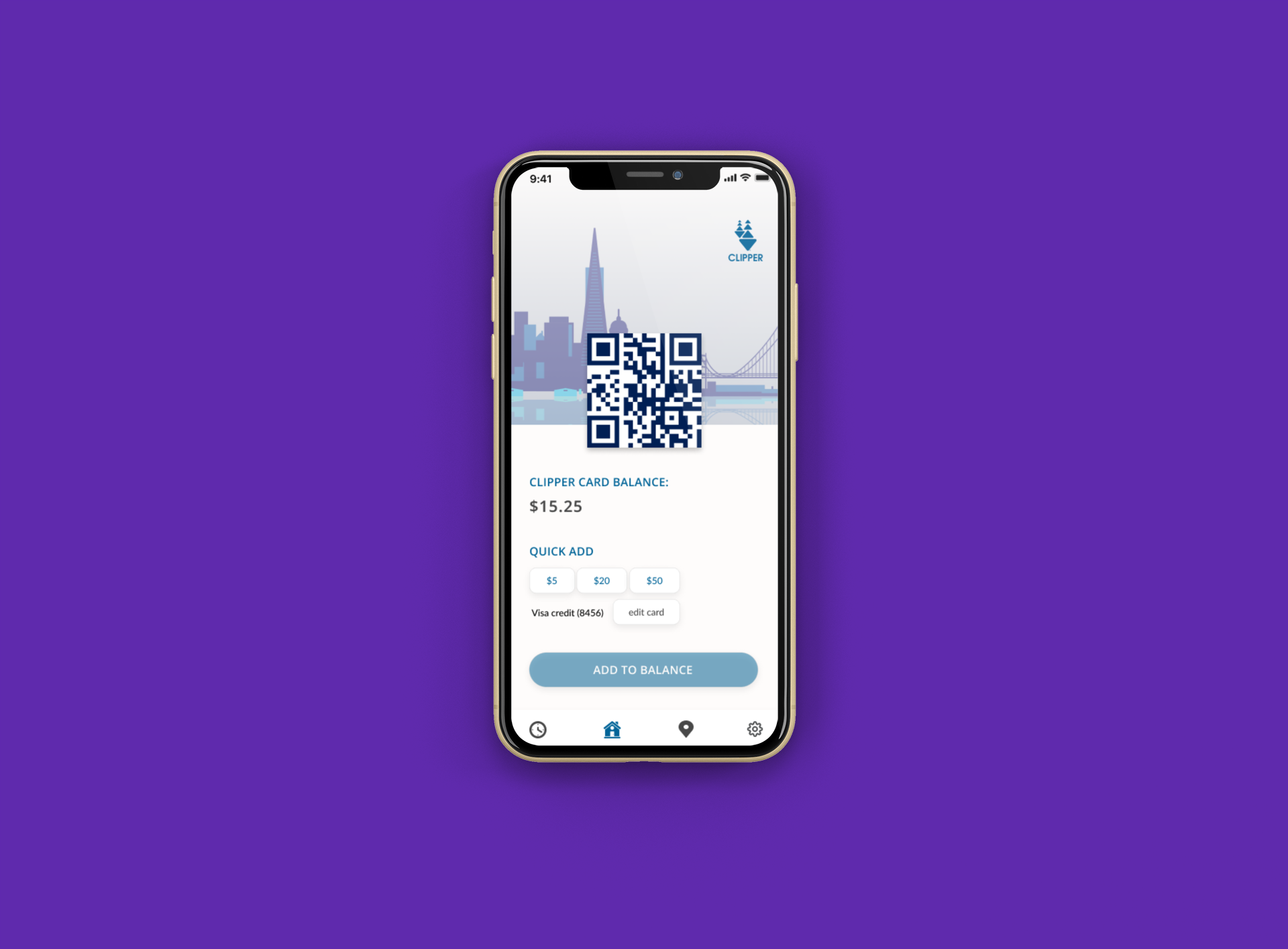
Home Screen
Home Screen of the app displays the QR code, allowing the user to quickly scan their e-ticket and enter the BART station.
Quick-add functionality allows users to easily add more money to their digital Clipper Card balance.

System Updates
Travel Advisories
Users can access System Updates through the bottom navigation, which features real-time updates about construction, delays, closures, and other pertinent information that might affect their travel.
Station Updates
Once the user has selected a station, they will be provided with real-time train arrival times for that station, allowing them to plan their trip accordingly.

Route Selection
Users who need directions can plan their route using the menu of options available here. A wide array of travel options are available here, including different modes of San Francisco public transportation and the ability to plan a trip in real-time or at a specified time and date.

Directions
Upon creating a route, the user is presented with their travel directions overlaid on a map.

Payment
At a glance, users can see which payment method they have on file and easily add a new card if they choose to. They can also load their Clipper Card from here.
Conclusion
This project allowed me to improve my interaction design and high- fidelity visual design. If I were to continue to build this prototype the next steps would be to explore adding new features in addition to testing the MVP.
New features I’d like to add:
Allow users to set their language preference and serve more demographics
Allow users to view their dynamically changing location on the BART map in real-time
Present users with alternate transit options if a significant delay or closure occurs
Particularly in the age of COVID, it’s important to find ways to maintain social distancing but save industries like public transportation. I hope that by designing an app that would reduce user interaction with surfaces like kiosks, it could potentially prevent risk of infection spreading.