Volunteering websites shouldn’t make you confused
Why streamlining the application process for nonprofits could increase the number of volunteers and reduce frustration.
Overview
Duration
Two week Sprint
Size of Team
Three Designers
Objective
Redesign UI of nonprofit to increase volunteers
Software
Figma
Role
Researcher and designer
Current State
Problem
Volunteers are needed urgently. Our client wants to improve the digital experience to better recruit volunteers, especially for the “hot spot” shifts.
Hypothesis
By emphasizing the volunteer opportunities on the website and creating a simpler process for sign up, we will potentially see an increase in the number of volunteers.
Solution Methods
information could be made more clear as to reduce any confusion for the user.
Reducing any inconsistencies in information architecture
Remove repetitive elements
Emphasize call to action
Research
Convenience & personal connection to the cause
Journey Mapping
Simplifying the form maybe the most crucial thing we can do to reduce frustration
Usability Testing
Users found the site and form design to be unusual and confusing. The form appeared to be a plugin that wasn’t consistent with the site brand.

User Personas
Occasional Altruist

Enjoys the feeling of contribution and helping others
juggles their time between job and social life,
Doesn’t want to sacrifice work or family time
Reluctant to make long-term commitments
Avid Advocate

Puts aside time specifically for volunteering
Volunteers on a regular basis
Advocates for the cause on social media
Wants to make a lasting positive impact
Iterations
Low Fidelity Sketches and Designs

Higher Fidelity Screens

Final Screens
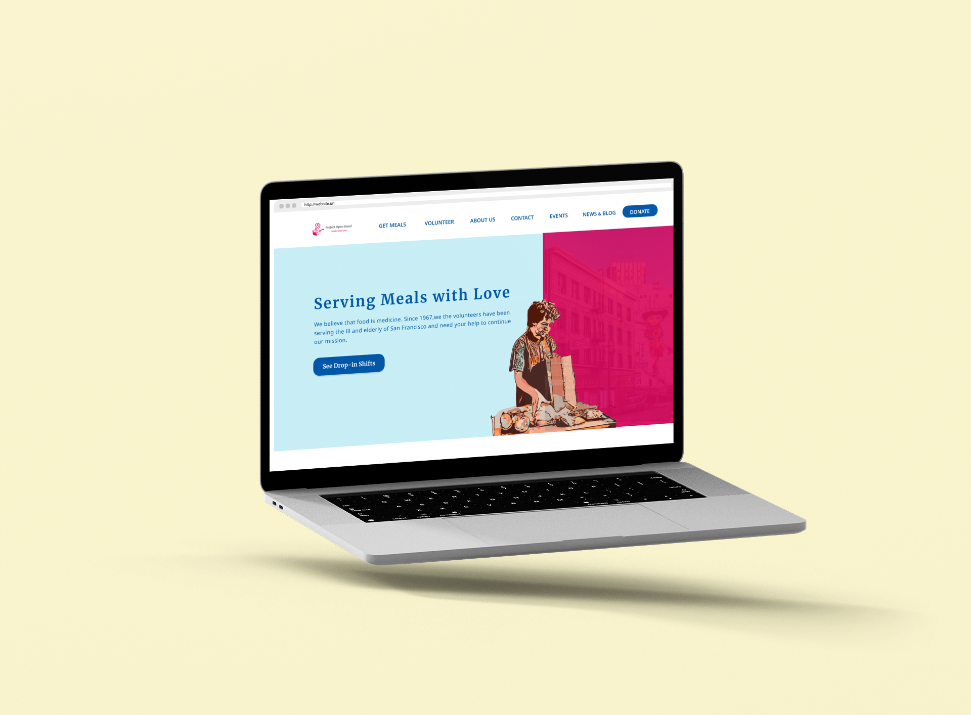
Navigation and Home-screen
We maintained a similar navigation scheme and landing page with only minor changes as to be consistent with the information architecture of the current site as to reduce any pain-points for old users.
Shift Selection
We incorporated the shift selection to be consistent with the brand and style of the current site. We provided more visual cues like a calendar as to make it more intuitive and overwhelming.
Shift Description
We elaborate further on the shift after selection is made to provide more details.
Volunteer Form
The form was made to be more simple including only necessary details and explain why the information was needed from them in the first place.
Confirmation Page
To provide instant gratification we made the language of the confirmation friendly and congratulatory.
Social Media
To increase engagement we provided an opportunity to share to possibly involve their friends and family.
Conclusions
A great philanthropic organization deserves a user experience that reflects their positivity and empathy. It’s imperative that an organization iterate on their web presence to maintain their business objectives and maintain positive relations with their users. Going forward this charity should continue to so usability testing and evaluate on their information architecture and copy.